Subscribe to:
Post Comments (Atom)
skip to main |
skip to sidebar
Quote
"Don't be stupid, don't be lazy, don't be proud"
Blog Archive
-
▼
2015
(41)
-
▼
January
(15)
- A Sundail For an Invisible City (AB)
- sundial project (RC)
- sundial (YS)
- Sundial (Stephen)
- Sophronia Arnel's poster
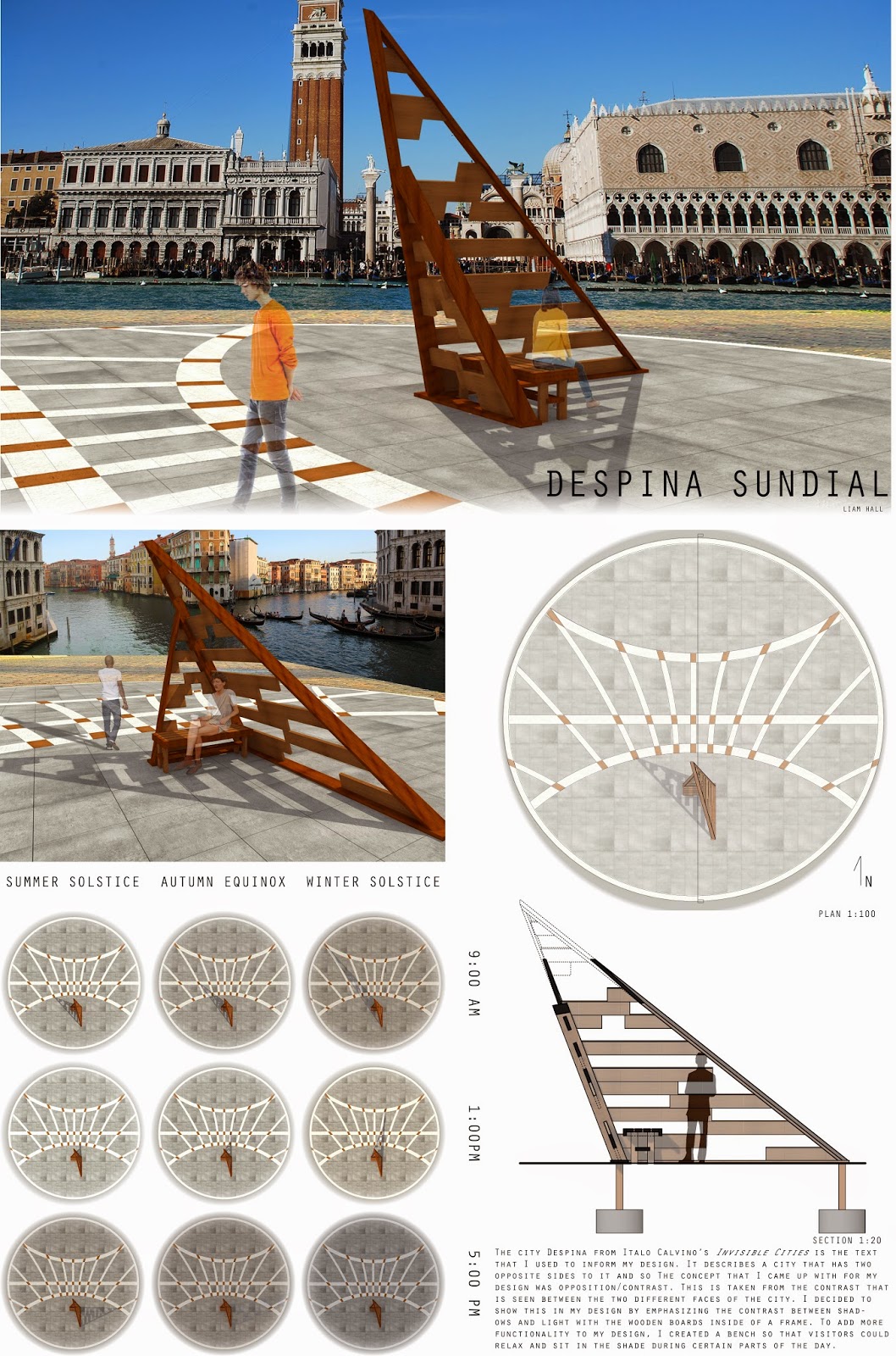
- Project 1 Sundial Poster (LH)
- Sundial (LV)
- Project 1 Sundial - Erik
- Final Sundial Poster (AC)
- Mariam Elzein- sundial poster
- Final Sundial Poster - Farah
- (Mitch) Final Sundial Poster
- Invisible Cities Final Poster - Daniel
- Sundial in Imaginary City (AC)
- Mitch - Sundial
-
▼
January
(15)
Labels
AC
(12)
project4
(9)
sketch
(7)
interim
(6)
precedents
(6)
feedback
(5)
lighting
(5)
Design Factors
(4)
deliverables
(4)
farah
(4)
final
(4)
John
(3)
cabin
(3)
design
(3)
design studio
(3)
digital model
(3)
intention
(3)
physical model
(3)
rendering
(3)
sundial
(3)
time management
(3)
writer's studio
(3)
DPI
(2)
Mariam
(2)
Sun study
(2)
Trinity bellwoods
(2)
competition
(2)
concept
(2)
double envelope
(2)
drawing
(2)
hand rendering
(2)
layout
(2)
museum
(2)
orthographics
(2)
pavilion
(2)
perspective
(2)
privacy
(2)
section 2
(2)
sectional axonometric
(2)
ventilation
(2)
yoga
(2)
Andrew Watts
(1)
Architect's Studio Companion
(1)
Architectural Graphic Standards
(1)
Aurthur Erikson
(1)
Bird's Eye View
(1)
Bridge
(1)
Burj Khalifa
(1)
CISC
(1)
Charette
(1)
Ching
(1)
Don River
(1)
Ed Allen
(1)
Erickson
(1)
Erik
(1)
Expo Milano
(1)
Fundamentals of Building Construction
(1)
Indirect lighting
(1)
Issuu
(1)
Kuma
(1)
Levitt Goodman
(1)
London Aquatic Center
(1)
Middle East
(1)
Modern Construction Handbook
(1)
Moss
(1)
Nasher
(1)
Nexus
(1)
Palladio
(1)
Pavillion
(1)
Pipes
(1)
Project 1
(1)
Queen's Park
(1)
SOM
(1)
SSEF
(1)
SSEF 2015
(1)
Skating rink
(1)
Steel
(1)
Steel Connections
(1)
Symmetry
(1)
XS
(1)
Zaha
(1)
adrian
(1)
applications
(1)
apps
(1)
apps and architecture
(1)
archdaily
(1)
area
(1)
axonometric
(1)
backdraft
(1)
below grade
(1)
cameras
(1)
context
(1)
contrast
(1)
convention
(1)
conventions
(1)
costa concordia
(1)
efficiency
(1)
elevation
(1)
exorcist
(1)
expectations
(1)
expression
(1)
failure
(1)
final address
(1)
final reviews
(1)
flexibility
(1)
focal point
(1)
form
(1)
gallery
(1)
green roof
(1)
humiliation
(1)
improvement
(1)
inspiration
(1)
layouts
(1)
lazy
(1)
liam
(1)
library
(1)
lighthouse
(1)
main idea
(1)
matterbetter
(1)
media
(1)
microapartments
(1)
mockery
(1)
norman foster
(1)
organic form
(1)
photoshop
(1)
plan
(1)
portfolio
(1)
preparation
(1)
presentations
(1)
pride
(1)
prismatic
(1)
progress
(1)
project 3
(1)
project1
(1)
reconfiguration
(1)
renzo piano
(1)
resolution
(1)
responsive
(1)
richard meier
(1)
scanner
(1)
schedule
(1)
se7en
(1)
section
(1)
sectional perspectives
(1)
sephronia
(1)
shawshank redemption
(1)
site
(1)
skills
(1)
sloth
(1)
small
(1)
solenne
(1)
spatial organization
(1)
studio deadline
(1)
stupid
(1)
sun
(1)
sundail
(1)
sustainability
(1)
technology
(1)
the godfather
(1)
tips
(1)
topography
(1)
transform
(1)
usual suspects
(1)
vengeance
(1)
wakeup call
(1)
wind study
(1)
windrose
(1)
wood
(1)
Total Pageviews
Also check out:
[OG×3] . Powered by Blogger.


Better selection of materials and demonstrated understanding of assemblage would have made the design presentation stronger. The rendering has too sharp a contrast and comes across as cartoony. Balance the contrast so that the montage reads better.
ReplyDelete