Pages

Sunday, 30 November 2014

PRESENTATIONS: SE7EN TIPS


Reviewers know the project brief NOT your design. 
Do not waste time reiterating the project. Speak to YOUR design intention as that is something unique to YOUR work. Nobody can get in your head without you presenting it properly.


Reviewers are open-minded and can appreciate good work. 
The critics all have been in your position so there is no need to feel intimidated. So long as you are clear and concise in your presentation, they will see merits in your work.


Permit the reviewers to offer feedback.
It is extremely impolite and frustrating when students see the reviews as an opportunity to "defend" their work or make excuses to validate their mistakes. Stop talking and take the constructive feedback to help you become better (get a partner to take notes if your can't do this properly).


Make eye contact with the reviewers.
It is frustrating when students read from notes, talk to the poster or the ground, or never connect with the reviewers. We are all people, so look up at them once in a while.


Practice your presentation.
You might have an incredible design and eloquent presentation, but if you go too long, you will neither receive enough time for feedback nor will you be considerate of others.


Treat your colleagues as you would like to be treated.
Do not go out of your way to make fun of, humiliate, or disrespect your peers during their reviews. This would include taking photos of them in uncomfortable situations, pinning up your drawings atop theirs, etc. What goes around comes around.


Do not present your design solely based upon its exterior. 
The interior spaces, operations, and organization are just as important as the exterior, contextualization, and approach.


Saturday, 29 November 2014

Step By Step Photoshop Process (Mitch)

Post-Process Steps I Took
btw I know there are leaves on the trees, I'll address that later

Source Image (Photo Credits to Farah)


Dropped in some snow


Added in footprints where the path would be


Dropped in my render


Used some curve and colour balance adjustment layers to achieve desired result


Added in falling snow and (too much) vignetting

Post-Processing in Photoshop

As promised (and a little late sorry) here is a before and after of a render that I did some minor post-processing to in photoshop. I added in light rays, dust particles and an exterior. I don't like the exterior as is, so don't do yours like mine. 


Before

 After

Thursday, 27 November 2014

DON'T BE STUPID

Follow Conventions 

Ensure that all elements of your presentation (notably the drawings) follow the conventions outlined in the course. Everything from North Arrows pointing up, hidden lines for roof lines, and section cut indicators should all be clearly read in the drawings no matter what level of rendering or additional work is done to the base line work.

Layout Matters

Do not think of the poster layout as simply a dump of all your imagery. Layout is just as much a design as the actual architectural proposal. Take the time to set up a layout with the imagery at the appropriate scale/size so that you know how large (resolution and size) to produce the imagery. If a prof takes a 1:25 scale to your 1:25 drawing and a door measures to be 4m high, you failed to show you understand scale drawings.

Do not waste space with huge titles, names, or blocks of text. Subtlety is important. If the reviewing audience is not aware of the nature of the project, they clearly are not worth listening to so there is no need to reiterate the nature of the project.

Fonts matter so be careful with what you use. Times New Roman or Calibri means you don’t care, Bank Gothic means you are stuck in the 90’s, Comic Sans means you should consider another profession…

Contrast Kills

In your renderings that you montage together, use the photo-editing tools to ensure your renderings blend in with the context.

Also be aware that when putting in trees or people into drawings or renderings, ensure that they are desaturated or at the very least muted to work with the rendering/drawing lighting conditions.

In physical models for this project, do not use fake or real plants, action figures, or even paints as they will look comical and detract from the design. You will also be made fun of by faculty and students alike.

In the digital model, do not overpopulate your spaces with downloaded furniture, plants, people, etc. This will prove to be distracting and even increase your rendering time. You are studying Architectural Science and NOT interior decoration.  Use pre-made elements with discretion… and just be aware that the rest of the class apparently has writers all shopping at the same high end furniture store.

Invest Time Appropriately

In making the physical model, remember that it is only worth doing if it is demonstrating something that is not evidenced clearly in the renderings and drawings. Do not waste time making a model for the sake of doing work.

In creating imagery/perspectives for your design, ask if there is any potential redundancy. If so, consider only doing one. Remember to kill two birds with one stone and see if you can use perspectives to showcase multiple dimensions of your design including diurnal use, seasonality, approach, etc.

Students are highly discouraged from creating full sheet renderings (i.e. an image that goes on a whole poster which would in this case be 200x36= 7200 pixels across!) as the rendering time becomes quite significant especially if you are using multiple lights, heavy geometries, highly reflective/transparent materials, etc.

DON'T BE PROUD


Demonstrate What You Have Learned NOT What Got You Here

The First Year, First Term curriculum is intense and is unlike anything most of you endured in high school. A great deal of material should have been adopted and adapted into your work. Those that show it will be rewarded. Those who have failed to demonstrate this will be dealt with appropriately. If you knew Photoshop coming in and still stick to Photoshop to create layouts, you are not learning anything. Are you too proud, stupid, or lazy to learn new material that will help you?
Show That You Listened and Learned from Your Profs Not Just Your Peers

While it is great to have picked up a great deal of information, tips, and tricks from classmates and certainly upper year students, understand that there is a reason why they are not your instructors. In many cases there is congruence between professors and upper years but on matters regarding pedagogy there are often points of divergence. As some of the second years fail to draw with line weights, while some of third years do not understand basic structures, it is better to integrate drawing and structural advice from your instructors… Believe it or not, the instructors actually know things…

You are Receiving Critical and Constructive Feedback 

Reviewers are there to ensure you are aware of not only what you have done well, but how you can improve. Whether it is technical advice, precedent suggestions, or design options, take this as positive insight. Even if you feel that the review is negative, it is for your own benefit. Do not try to “DEFEND” yourself as it sets up an antagonistic relationship. Critics are here to help improve you so there is no need to get hostile…

You ALL Can and Must Improve

Nobody is perfect so do not expect the reviewers to praise everything you do. Critics see the potential and will highlight how you can become better and what to improve upon. If there were NO criticism, there was never a project to respond to. If the best criticism that can be said is that you plotted on “nice” paper, consider it “pity praise”. If a critic states your design is well-contextualized and works with the site, consider it a compliment.  If a critic says, “Nice trees”, consider it an insult.

Do NOT Mock Classmates

The fastest way to get crucified yourself is to make fun of or disrespect another classmate. You
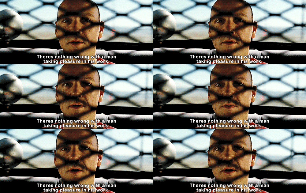
are all learning and everyone makes mistakes. For ALL professors, such displays of arrogance are not tolerated; for certain professors, students demonstrating such contempt are dealt with appropriately (Ezekiel 25:17).

DON’T BE LAZY


Line Weights Matter
Do not cut corners when drafting your orthographics

Sectional Perspectives Are NOT Orthographic Sections
Even if the cut plane is at scale, the convergence of a perspective invalidates any other geometry beyond it. A sectional perspective from a 3D model is not good enough at this stage and should be considered at the same level as a rendered perspective.

Assign Appropriate Resources to the Physical Model
Do not get caught by surprise making the model on the last day. Good models take time. You must be honest with yourself in allocating an appropriate amount of time to put together a model.
Do not desecrate your models with twigs, rocks, toys, or other garbage that do not clearly showcase your design intention. The focus should be on the design and NOT the super detailed toy car, cartoon trees, or glued oregano on the model…

Take the Time To Properly Set Up Work
There is a workflow in getting to the final project poster and booklet. If you are doing drawings at a specific scale, ensure that you scan the material at a high resolution to work into a poster. It would be tragic to work on a rendering or drawing at a low resolution and then have to see it get pixelated in a final poster simply because the material was not setup to the right resolution at the outset.
Remember to use the general rule for this project DPI (200 DPI) so you just have to use the basic calculation:

RESOLUTION (DPI) x IMAGE SIZE (INCHES) = Pixel Width

If you need the rendering to be 10 inches wide, then the horizontal dimension of your image would be 200 DPI x 10 Inches = 2000 pixels across.

Tuesday, 25 November 2014

Last minute design adjustments- mariam

Just thought of sharing some of the issues Vince pointed out for me to fix


Edited Version


I would have shared the interior adjustments, but my renderings are still too dark..

Sunday, 23 November 2014

New design ideas (Daniel)

I've revised my design and made some significant changes, altering the roof, overhang, and north side, as well as the desk and counter on the inside. Here are some screenshots:


I've also been looking at the idea of changing the roof so it's not so disjointed, perhaps with a structure like this:

Any feedback from anybody would be appreciated.


Saturday, 22 November 2014

Interim Layout (LV)


Stan's Remarks:

  • redesign movable wall (fix proximity of murphy bed and toilet)
  • work on context of site
  • create several sections (plan, elevational, and perspective) to increase understanding of the functionality of the movable wall. 
  • Create own legend/conventions for dashed lines to imply movement and to imply the folding out components.

Friday, 21 November 2014